english-for-designers
Visual style for the Bollywood Film Festival
The idea of the whole project
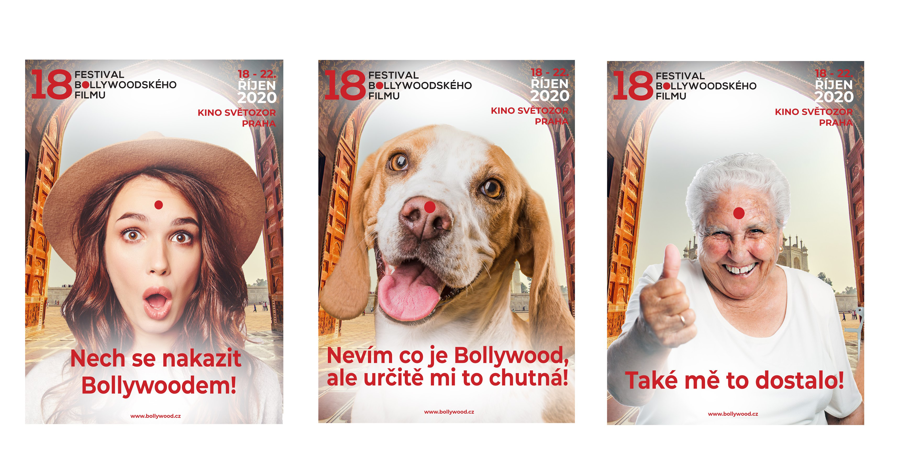
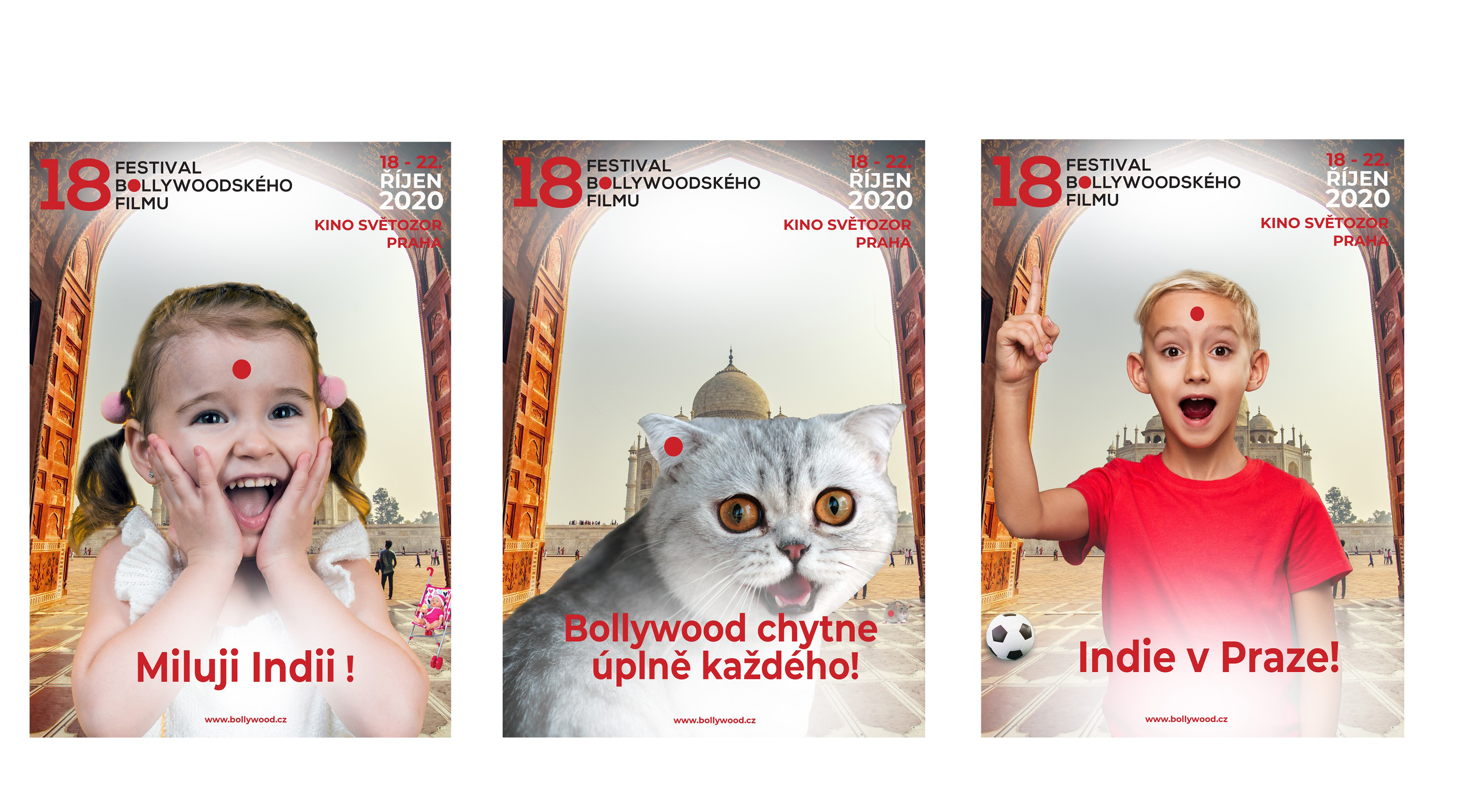
The visual style of the festival is based on a red dot, which symbolized married women in India, which actually represents the 18th year of the festival. 18 years symbolizes adulthood, marriage, building a career, starting a family. The red dot plays the role of a restless dot in this concept, infecting the Bollywood mood of anyone it catches. Anyone who learns about Bollywood festivals will be endowed with an imaginary red dot that draws him into Indian culture and dances his senses. The goal of the Bollywood Festival is for people to relax, get to know a new culture, have fun and be drawn into the magical Indian world, which enchants them with its otherness.
Bollywood evokes fun, joy, passion, love, mystery, laughter, humor, unexplored new culture.
The logo was designed simply with a red dot as the main element in the design.
![]()
![]()
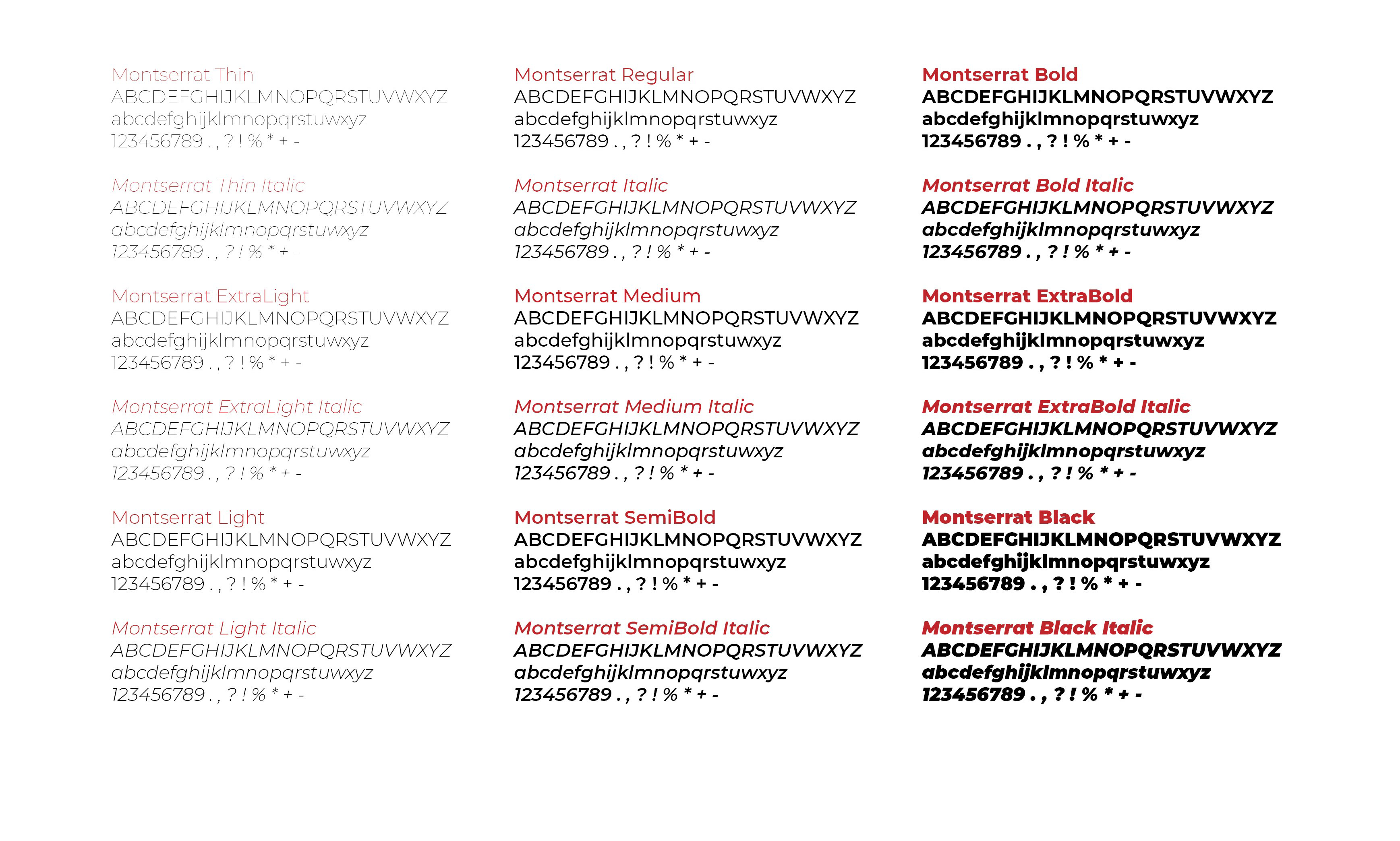
The font that represents this design is called “Montserrat”. I used it because it has many cuts that can be used on various advertising media, but also on social networks, or in ordinary communication in e-mails.
The posters reflect the idea that Bollywood can be loved by really everyone. Whether it’s an old pensioner who loves Indian soap operas, a young woman who has traveled half of India, children who are fascinated by a different Indian culture, or even a dog who is happy to see her master shake off in the evening with Indian movies.
The design for the spot was conceived in such a way that ordinary people stand and wait for the subway, everyone is watching their own, until suddenly Indian music is heard from the microphone and a red dot appears from the radio, which gradually starts to mark everyone. Then people start dancing, having fun together with Indian music. They all run out of the metro and start dancing together, the red dot dances the whole of Prague (people, animals, buildings (eg Dancing House), trams).